(Brand guidelines) // Developer tools
Supabase brand
guidelines
Supabase’s logo, colors, fonts, voice, and dos and don’ts, from the Brand Skill Rainbrand built from supabase.com.
Download the Brand Skill
- Supabase green#3ECF8E
- Dark gray#1C1C1C
- Light gray#F8F8F8
About Supabase
Supabase is an open-source Postgres development platform for building applications, with integrated backend services including authentication, APIs, functions, realtime, storage, and vector search. Its brand communicates practical developer empowerment: a modular platform that is open, portable, and ready to scale.
Supabase logo




Use the Supabase wordmark, the symbol together with the Supabase lettering, by default when there is room for the name. Use the standalone green symbol in small spaces such as avatars, app icons or a row of partner logos. Select a logo variant for the background behind it: the green-and-black wordmark is for light backgrounds, and the green-and-white wordmark is for dark backgrounds. The single-color black and white wordmarks are for one-color printing or placement over a photo. Every wordmark includes the symbol; there is no lettering-only version.
Use the official files as they are. Keep their colors intact and do not repaint or alter the mark. Write the name as “Supabase”: one word, capital S.
Supabase colors
Supabase green
Signature green and main logo-symbol color
HEXRGBDark gray
Background behind the logo
HEXRGBLight gray
Background behind the logo
HEXRGB
Supabase fonts
Inter
Headings · 500, Body · 400
Manrope
Customer quotes · 500
Source Code Pro
Code · 400
Font names only. The Brand Skill download doesn’t include font files.
Supabase’s voice
Write for developers in a clear, direct, confident, and practical voice. Pair straightforward technical detail with an emphasis on flexibility, openness, and building at scale. Keep claims concrete and focused on what teams can do.
- “Build in a weekend, scale to millions”
- “Use one or all. Best of breed products. Integrated as a platform”
- “Open source from day one”
- “Read, contribute, self-host. You’re never locked in, and always in control”
Dos and don’ts
Do
- Use the wordmark by default when the layout has room for the Supabase name; choose the background-appropriate version.
- Use the standalone symbol when space is limited.
- Keep the logo artwork and its colors unchanged.
- Write “Supabase” as one word with a capital S.
- Keep copy direct, technically grounded, and focused on developer capability, openness, and scale.
Don’t
- Don’t repaint or alter the logo artwork or its colors.
- Don’t use the standalone symbol where the name is needed and space allows the wordmark.
- Don’t spell the name “SupaBase” or “Supa Base.”
- Don’t use the Supabase logos for anything other than referring to Supabase.
Supabase imagery
46 images from supabase.com, in 4 files of the Brand Skill. Each file starts with its guidance, then shows the images it refers to.
Brand and marketing imagery
11 imagesUse Supabase’s own identity and marketing imagery to anchor branded creative work, including social-sharing graphics and editorial and product-marketing artwork.











Product and interface imagery
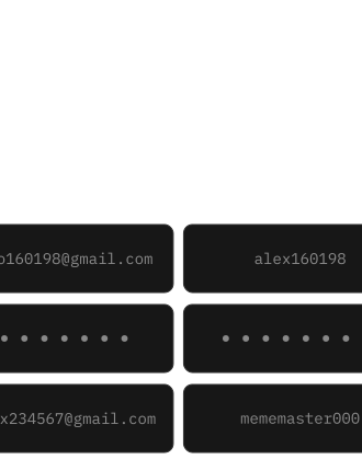
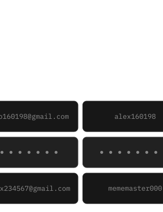
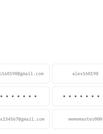
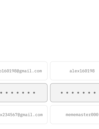
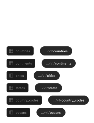
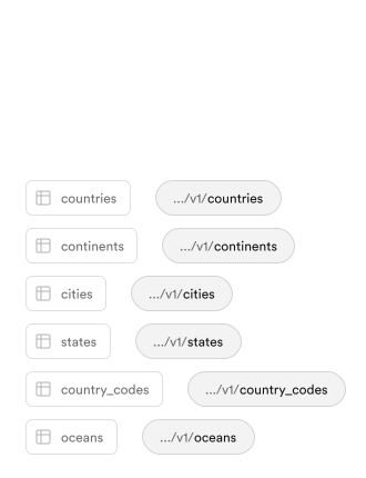
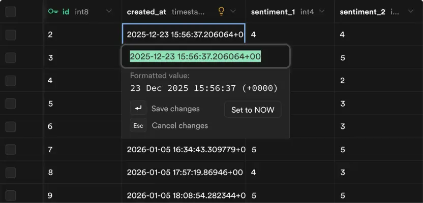
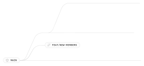
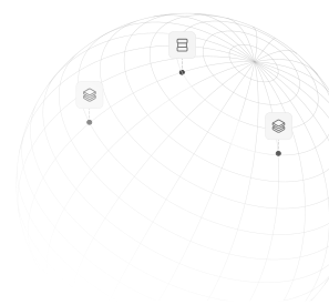
31 imagesSupabase’s product storytelling uses real interface and workflow imagery: database tables, SQL, branching and replicas, compute and storage controls, authentication, and deployment or observability views. Use product visuals to make technical capabilities tangible.














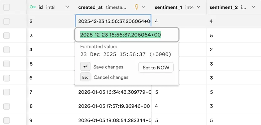
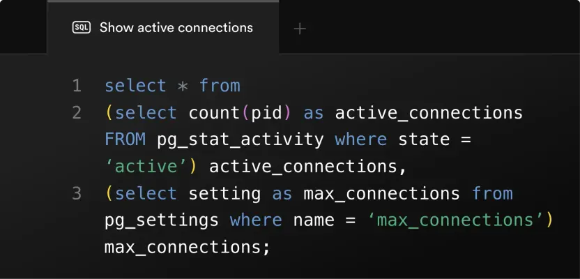
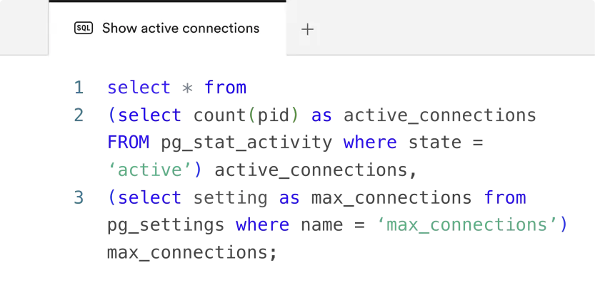
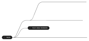



Integration imagery
2 imagesThe Connect Supabase buttons are integration controls for starting an OAuth flow, not logos. Use the matching button artwork for its intended light or dark setting.


Partnership imagery
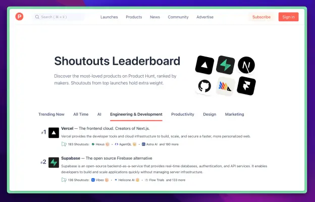
2 imagesSupabase presents partnerships, such as its work with Vercel, as co-branded imagery. Keep that partnership context when drawing on it for partnership-related creative work.

Download Supabase’s Brand Skill
A Brand Skill is a folder of brand guidance written for agents. Give it to Claude, ChatGPT, Cursor or another agent and ask it to follow Supabase’s guidelines. It starts at SKILL.md, which points to the right file for each task.
It has the guidance, 48 images and the logos. The font files belong to Supabase, Inc, so they’re left out.
supabase-brand-skill/
├ SKILL.md
├ README.md
├ references/
│ ├ voice.md
│ ├ dos-and-donts.md
│ ├ brand-imagery.md
│ ├ product-interface-imagery.md
│ ├ color.md
│ ├ logo.md
│ ├ integration-imagery.md
│ ├ typography.md
│ └ partnership-imagery.md
└ assets/
├ images/
└ logos/
Rainbrand’s Brand Agent built this Brand Skill from supabase.com on 30 Oct 2026. It isn’t Supabase’s official guide. Reviewed by Siddharth Borderwala, Founding Engineer at Rainbrand.
Supabase and its logos are trademarks of Supabase, Inc. Rainbrand isn’t affiliated with or endorsed by Supabase, Inc.

Make one for
your brand.
Add Rainbrand to your agent and give it your website, brand guide or files. Rainbrand builds a Brand Skill like this one and keeps it up to date.

Open the Rainbrand plugin and add it.
Open Rainbrand plugin (opens in a new tab)Connect your Rainbrand account when asked. It works in ChatGPT and in Codex.
More brand guidelines
See all brands AWS brand guidelinesDeveloper tools
 GitHub brand guidelinesDeveloper tools
 PostHog brand guidelinesDeveloper tools

Rainbrand builds and maintains shared brand context for your agents and products